Glitch Text Generator – Distorted Text Copy & Paste
That's what this tool does. You type plain text. It hands back something broken-looking. However far you want to push it.
What Is Glitch Text?
Glitch text is normal text made to look like a digital mistake.
Think of things that already look “broken” on a screen. A corrupted video, like static cutting in and out. A dying old TV with a tilted image. A glitchy app freezing mid-tap. A file that won’t open right and shows random symbols.
Glitch text borrows that look. Then it applies it to letters.
It’s not brand new, either. It grew out of internet styles like glitchcore, vaporwave, cyberpunk, and creepypasta. Anywhere “something’s wrong here” is the vibe, glitch text shows up.
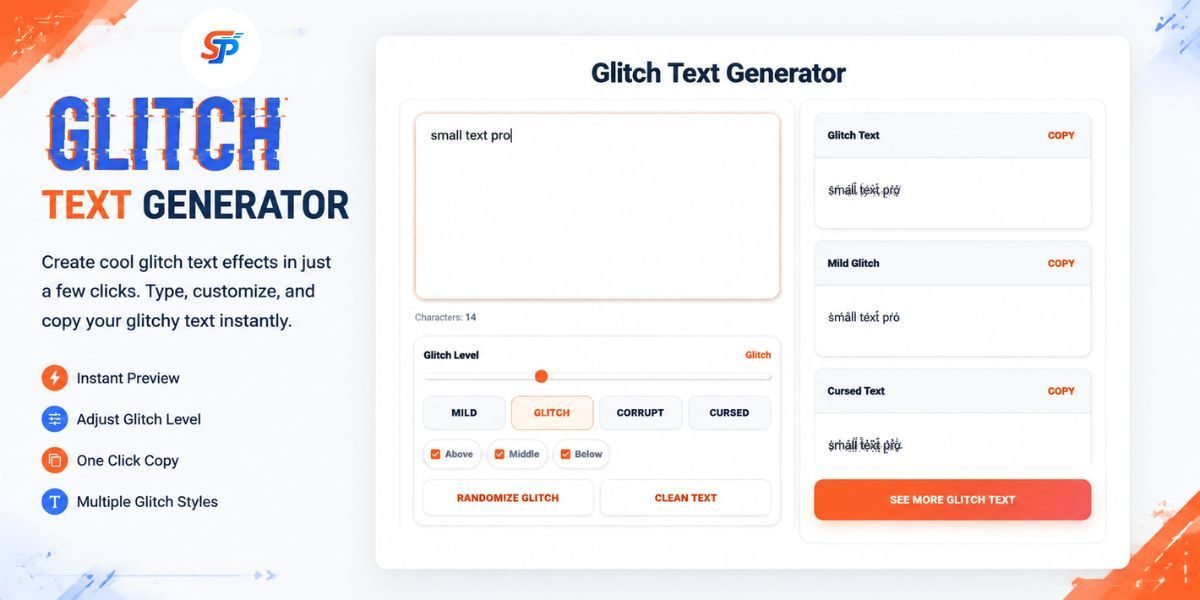
You Don't Need Design Software to Create It
No Photoshop. No coding. No downloading a weird font from a sketchy site.
Most generators work in three steps:
- Type your text.
- Pick how intense you want it.
- Copy the result.
Some tools let you choose where the mess sits. Above your letters. Below them. Through them. For example, one setting may pile marks over the top, another may drag them downward, and another may slice across the middle.
How Does Glitch Text Work?
Short answer: Unicode combining marks.
Here’s the simple version.
Unicode is the system computers use to show text. Every language. Every alphabet. It covers plain letters such as A, B, and C. It also covers accents, symbols, and thousands of other characters.
Some of those characters can’t stand alone. They’re built to attach to the letter before them. These are called combining characters.
A basic example: “a” plus an accent mark can look like “á.”
A glitch generator does this many times, on every letter:
Letter + mark + mark + mark + mark
Stack enough marks on enough letters. You get that messy, overflowing look people call Zalgo or cursed text.
Glitch Text Is Usually Not a Real Font
Worth clearing up. This trips people up a lot.
A real font just changes how a letter looks. Write “A” in Arial or Times New Roman. Underneath, it’s still the same character.
Glitch text works differently.
Take the letter A.
The generator might turn it into
Ḁ̴͌
The original A is still in there. The generator just bolted extra characters onto it.
That’s why you can copy this straight out of your browser. Paste it anywhere. No installing anything. No font file involved.
So when someone searches “glitch font generator,” they usually want a Unicode text generator. Not an actual font.
What Are Unicode Combining Marks?
There’s an official Unicode block for this. It’s called Combining Diacritical Marks.
It runs from U+0300 to U+036F. Unicode describes these as marks intended to be used alongside other characters.
Inside that block, you’ll find:
- Grave accents
- Acute accents
- Tildes
- Dots
- Hooks
- Overlines and underlines
These weren’t invented for memes. They exist for real languages and real phonetic spelling.
Glitch text borrows their stacking ability for looks. And this isn’t the only Unicode range with combining marks. There are others too.
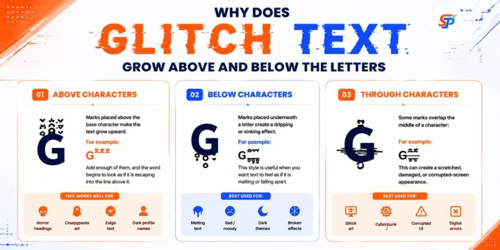
Why Does Glitch Text Grow Above and Below the Letters?
Combining marks don’t all sit in the same spot.
Some go above a letter. Some go below. Some land right in the middle.
Generators use this to shape the distortion.
Above Characters
Marks placed above push the text upward. Like this:
G̋̍̎͑
Stack enough of these. The word looks like it’s climbing off the line above it.
Good for Zalgo-style horror headings. Dark usernames. Creepypasta visuals.
Below Characters
Marks placed underneath drag the text down. Like this:
G̥̩̪̬
This gives a melting or sinking feel. Useful when you want something to look like it’s falling apart.
Through Characters
Some marks sit right through the middle of a letter:
G̴̶̷
This creates a scratched, damaged, corrupted-screen look.
Combine all three directions. Things get intense fast.
How to Customise Glitch Text
Maximum chaos isn’t always the goal.
The best generators give you real control.
Choose the Intensity
Many tools offer presets like mild, glitch, corrupted, and cursed. For example, “mild” might add a few marks to one word, while “cursed” can cover the whole line. For extreme distorted effects, you can try our Zalgo Text Generator to create chaotic Unicode-style text.
Mild adds a few marks per word. Still readable. Cursed piles on so many marks the original text gets hard to make out. For a username or bio, go lighter. For a horror poster or thumbnail, push it as far as you want.
Control the Direction of the Effect
Some tools split the distortion into separate sliders. Not just one blunt intensity setting.
Above — adds marks over the letters. Classic Zalgo look.
Below — creates that dripping, sinking feel. Good for dark or horror-themed graphics.
Through — adds scratches across the middle of letters. Good for a broken-screen, damaged-data feel.
Adjusting these separately usually looks cleaner. Better than just cranking every setting to max.
Other Ways to Create a Glitch Effect
Combining marks aren’t the only trick.
Greek and Cyrillic Lookalikes
Some Latin letters have close visual cousins in Greek or Cyrillic. A generator can swap letters for these lookalikes. For example, it might turn a familiar word into one that looks strange but still reads the same at a glance.
One catch: these are genuinely different characters underneath.
A lookalike letter might not behave like the real one. Not in search boxes. Not in @mentions. Not in usernames or URLs.
Save this style for decoration. Not for anything you need to type or search for later.
Mathematical Symbols
Symbols like Σ ∫ √ ∞ Δ can give text a technical or cyberpunk feel. A fake error message might mix plain text with a few of these: for example, one line could pair a warning with a symbol.
ERR_⁴⁰⁴ // Δ SYSTEM FAILURE
You don’t need heavy Zalgo marks to sell a glitch look. A few well-placed symbols often do more than a wall of stacked accents.
Reverse and Upside-Down Text
The simplest option: flip the text.
GLITCH becomes HCTILG
Some generators go further. They swap letters for Unicode characters that look rotated.
Unicode doesn’t have a perfect upside-down match for every letter. So this is always an approximation. Still works fine for memes and bios.
Extra Letter Spacing
Not every glitch effect needs to be messy.
Spacing letters out gives text a clean, retro-computer feel:
G L I T C H
Great for headings and minimal designs. Full cursed text would just be too much there.
Creating Animated Glitch Text and GIFs
Copy-paste Unicode text is great when people need to copy it.
For video or artwork, animated glitch text usually hits harder.
An animated version might flicker. Jump sideways. Swap symbols. Flash between clean and distorted. Simulate signal interference. For example, one frame may look normal, and the next may look corrupted.
You’ll see this in YouTube intros. Horror videos. Music visuals. Stream overlays. Game edits.
Why Transparent Backgrounds Matter
A transparent background lets you drop the animated text straight over another video or image. No solid box behind it.
Picture “CONNECTION LOST” layered over security-camera footage. The footage stays fully visible underneath.
Which Glitch Level Should You Use?
Match the intensity to the job.
Mild — best for names, titles, anything people actually need to read. Good for display names, small headings, phone screens, and short bios. For example, use it when you want a username to feel distinct yet remain readable.
Glitch (medium) — the sweet spot for most social content. Good for captions, Discord bios, quick posts. For example, use it when you want the effect to stand out without overwhelming the text.
Corrupted — visual impact matters more than readability here. Good for horror posters, thumbnails, album art, social graphics. For example, use it when the text needs to look damaged at a glance.
Cursed — heavy Zalgo. Treat it as artwork, not something people will read line by line. Good for horror imagery, experimental design, one short dramatic phrase, and image overlays. A whole paragraph in cursed mode is rarely a good idea.
Useful Animation Controls
Depending on the tool, you might adjust:
- Animation speed
- GIF duration
- Flicker amount
- Distortion strength
- Background
- Color inversion
Need the look to stay the same everywhere? Export an image or GIF instead of copy-pasting text. That way the effect doesn’t depend on how the app renders Unicode.
Why Glitch Text Looks Different Between Apps
You build the perfect cursed text in your browser. You paste it somewhere else. Half the effect is gone.
That’s normal. Not a bug on your end.
Different apps handle unusual Unicode differently. Some clip marks that stretch too far. Some strip out characters they don’t recognise. Some quietly rewrite the text. Some swap in a different font. Some limit line height, so tall stacks get cut off. Some reject the string entirely.
People sometimes call this “app clamping.” That’s when an interface stops combining marks from spreading too far.
Either way, the result is the same. Your phone, your desktop browser, and whatever app you paste into may all show slightly different versions of the same text.
Preview heavy glitch text in the actual place you’re using it before you commit to it.
Three Glitch Text Mistakes Worth Avoiding
- Using heavy glitch text as your login name. A decorative display name is fine. An account identifier is a different job. If your username is loaded with lookalike characters and stacked marks, typing it on another device gets annoying fast. Keep login info simple.
- Assuming search treats every version the same. Two strings can look identical to a human. But they can be completely different underneath. “GLITCH” and a version built from Greek letters or heavy combining marks aren’t the same string to a search tool. If people need to find you, keep a plain-text version around too.
- Glitching an entire paragraph. This is where it usually falls apart. Marks from one line can bleed into the line above or below it. On a small phone screen, several lines of heavy Zalgo text can turn into an unreadable smear. One glitched phrase almost always beats a fully glitched page.
Glitch Text and Accessibility
A cool effect shouldn’t cost you usability.
Heavy combining marks can be hard for assistive technology to process. They can also make text harder to copy, read, and navigate. This is especially true for anyone using a screen reader. Or honestly, for anyone at all.
Keep the essentials in plain, normal text. Menus. Buttons. Form labels. Instructions. Error messages. Product details.
Want glitch text on a heading or artwork? Keep a clean, readable version nearby too.
Treat glitch text as decoration. Not your main message.
How to Choose a Good Glitch Style
Ask yourself a few quick questions first:
- Does this need to stay readable, or is it pure decoration?
- Where’s it going? A username field, a caption, a poster.
- Will it be read on a small phone screen?
- Does someone else need to type this later?
- Is this important content or just an error?
Match the intensity and direction of the effect to your honest answer.
Final Thoughts
Glitch text works because it takes something completely familiar — plain letters — and makes it feel slightly wrong.
Underneath all the scratched marks and dripping symbols, there’s no secret corrupted font. It’s just ordinary text wearing Unicode characters like a costume.
That simplicity is exactly what makes a glitch text generator useful. A subtle, mild effect for a username. A full wall of Zalgo for a horror project. Or a broken “404” that looks like it came straight from a dying system.
Frequently Asked Questions
What is a glitch text generator?
A tool that takes normal text and adds Unicode characters. Usually combining marks. It makes text look distorted, corrupted, or Zalgo-style. Copy the result. Paste it wherever it's supported.
Is Zalgo text the same as glitch text?
Not exactly. Glitch text is the broader category. Zalgo text is one style inside it — the heavy stacked-marks look.
How does a glitch text generator work?
It takes your plain text. It attaches Unicode combining marks, or swaps in lookalike characters. Then it outputs a copy-paste-ready string.
What are Unicode combining marks?
Unicode characters built to attach to the character before them. Like accents. Glitch generators stack many of these on each letter.
Can glitch text be used on Instagram?
Sometimes, in certain text fields. Support and character limits vary by field type — bio, caption, display name — and can change. Test it in the actual field before relying on it.
Why does glitch text look different on another device?
Different operating systems, browsers, and apps render Unicode differently. Some clip marks. Some strip unsupported characters. Some swap fonts. Same text, different result.
Does glitch text work everywhere?
No. Don't assume that. Unicode support, fonts, operating systems, browsers, and input filters all vary. Any of them can change how your text displays.